However I saw my colleague doing a search and I was impressed with the fact that it finally searches within text areas! Previously when I was updating large text files in webmin like httpd.conf or the aliases file, I had to Ctrl-A Ctrl-C (copy all) and Ctrl-V (paste) it into Notepad++ before I can do some proper searching and text editing.
Firefox 2's new spell checker is a bonus too. The dotted red lines are far less obtrusive than regular word processors wiggly red lines. Its nice.
What I didnt like about Firefox 2 was the way it displayed the tabs. Unlike Firefox 1.5, it would keep the width of the tabs and scroll new tabs along. This is unnecessary usage of screen real estate, and the individual close (x) buttons are either very hard to hit when you need them, or extremely easy to click on when you dont expect it to.
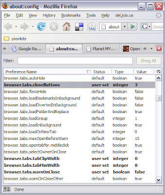
So here's how to change it to a better behaviour. Type in "about:config" in the URL bar. You should see something like this:
 To change the close tab buttons to appear on the right hand side as in Firefox 1.5, change
browser.tabs.closeButtons = 3
To make sure that the tabs shrink to fit, change this:
browser.tabs.tabClipWidth = 0
browser.tabs.tabMinWidth = 0
Firefox 2.0's tab behavior would be close to what 1.5 handled them. Add-ons like "mouse gestures" and "Free Download Manager" was automatically upgraded and installed.
So far, no hassles.
yk.